geografia
2008-2015 Marumo Printing
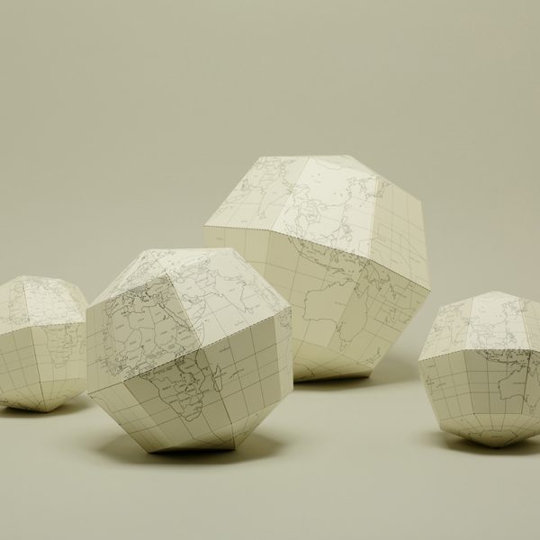
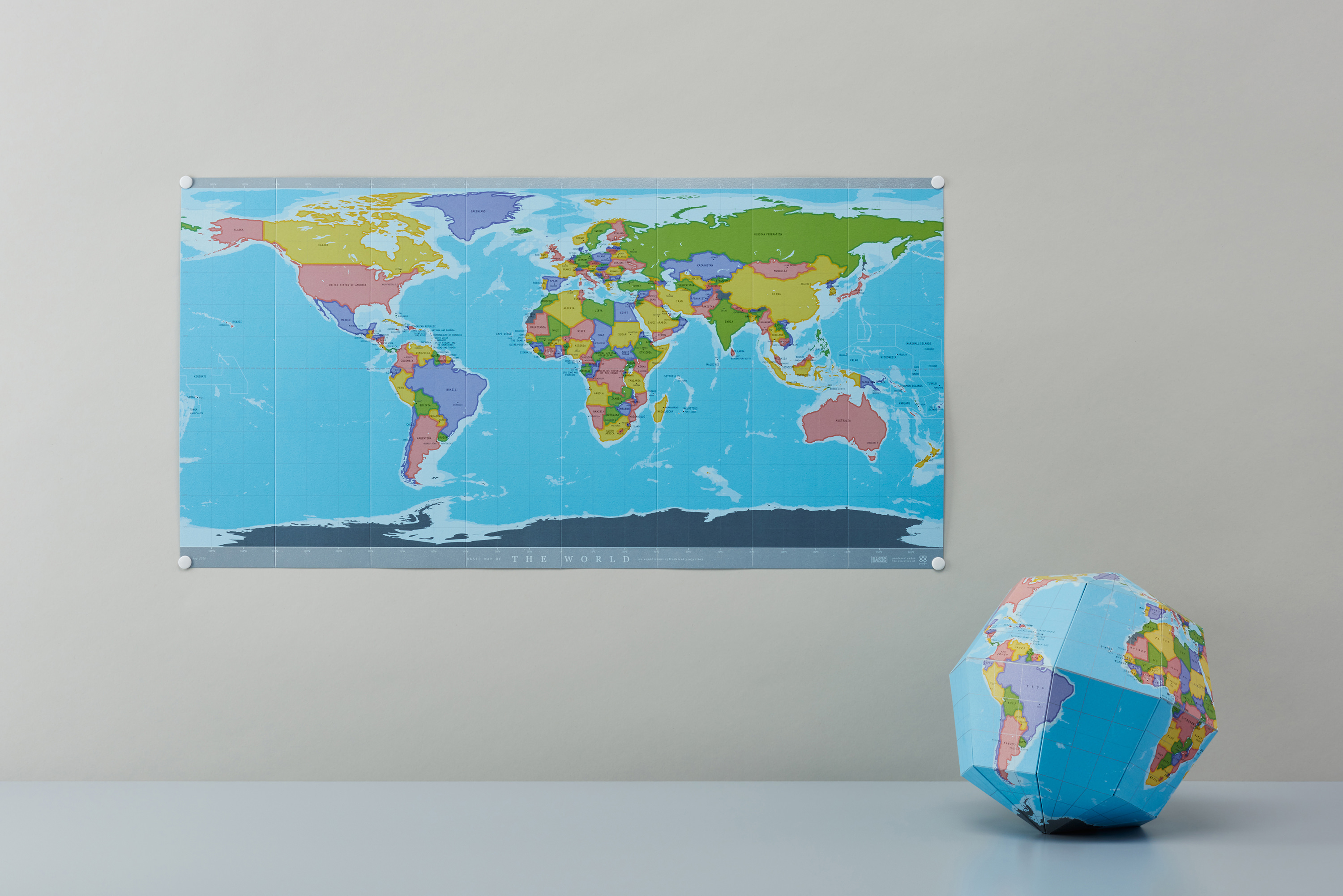
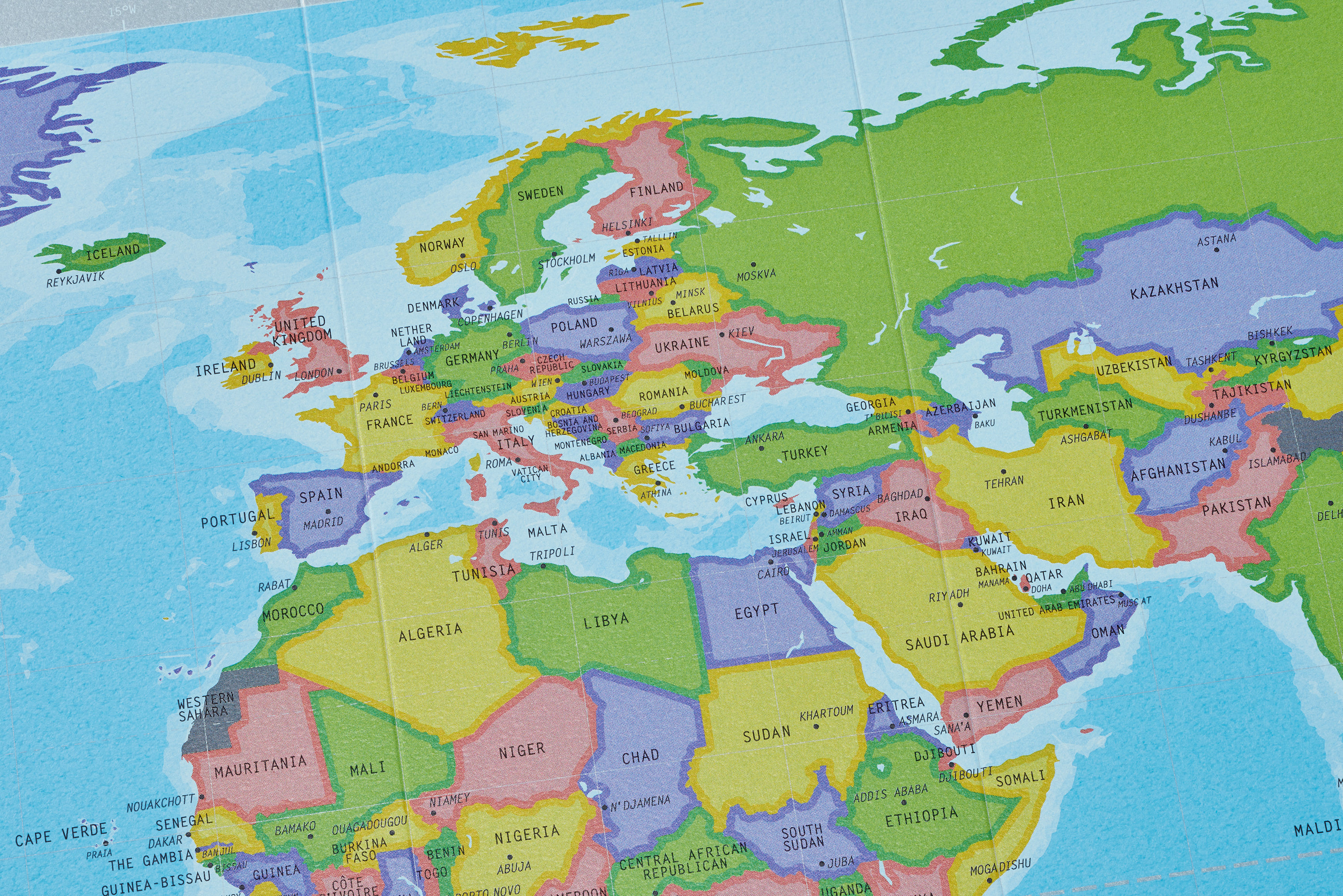
Stand-alone WORLD MAP
屏風(ビョウブ)のように立てておける正距円筒図法の世界地図。折り目をのばし、壁にはって楽しむこともできる。
A world map that you can stand it on a table like a folding screen.By smoothing out the creases, it can be used as a wall map. This map is drawn on the equidistant cylindrical projection.
–
Brand : geografia
Design Period:2015
Photo:Ryoukan Abe
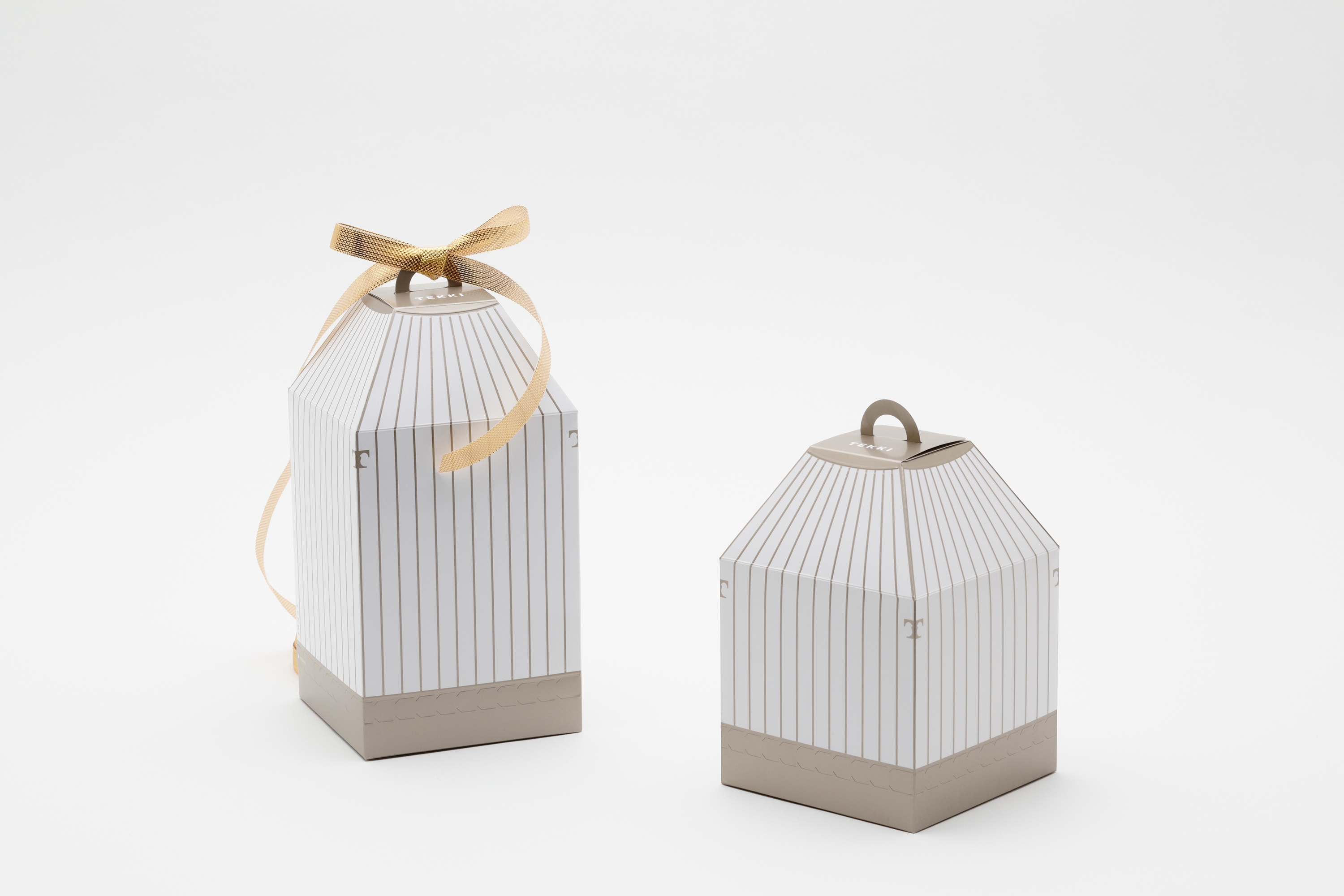
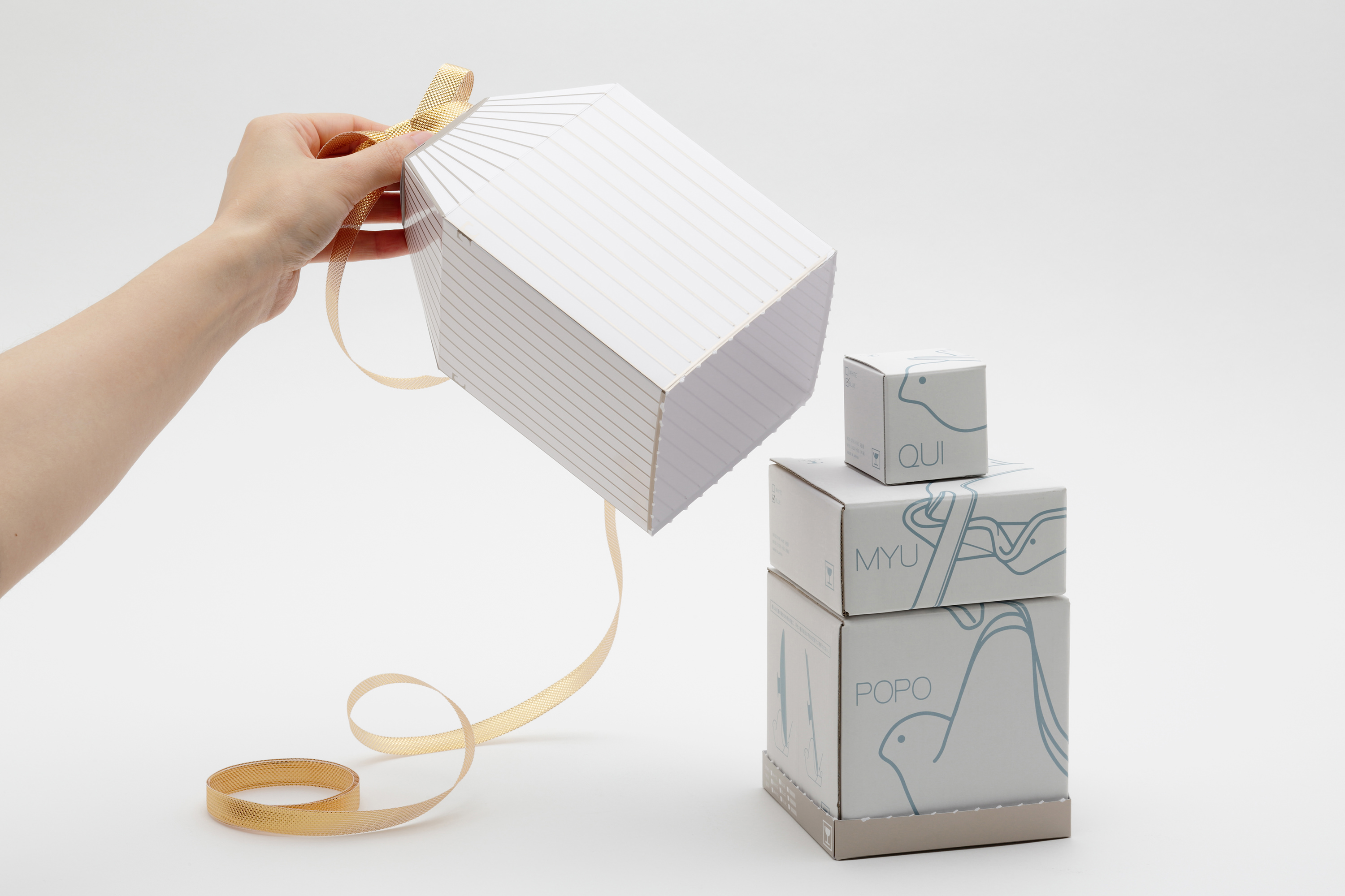
TEKKI gift package
鳥かごをイメージさせるギフトパッケージ。3種類の箱が収まるように設計されている。パッケージを開封すると、籠から鳥を放つようにTEKKIの鳥のキッチンツールが飛び出してくる。個々のパッケージは、製品のイラストが斜めの角度から見えてくるように描かれている。
Gift Packaging in the shape of a bird cage. It is designed to fit in exactly three boxes. To open the gift package the cage has to be ripped and lifted to set the birds free.
–
Client:TEKKI
Design Period:2012
Award : Japan Package Design Award 2013
Photo:Ryoukan Abe
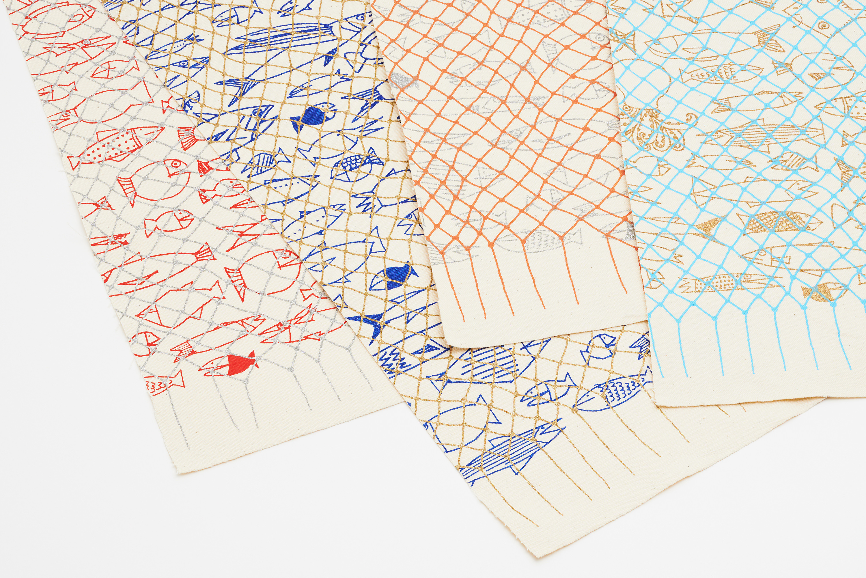
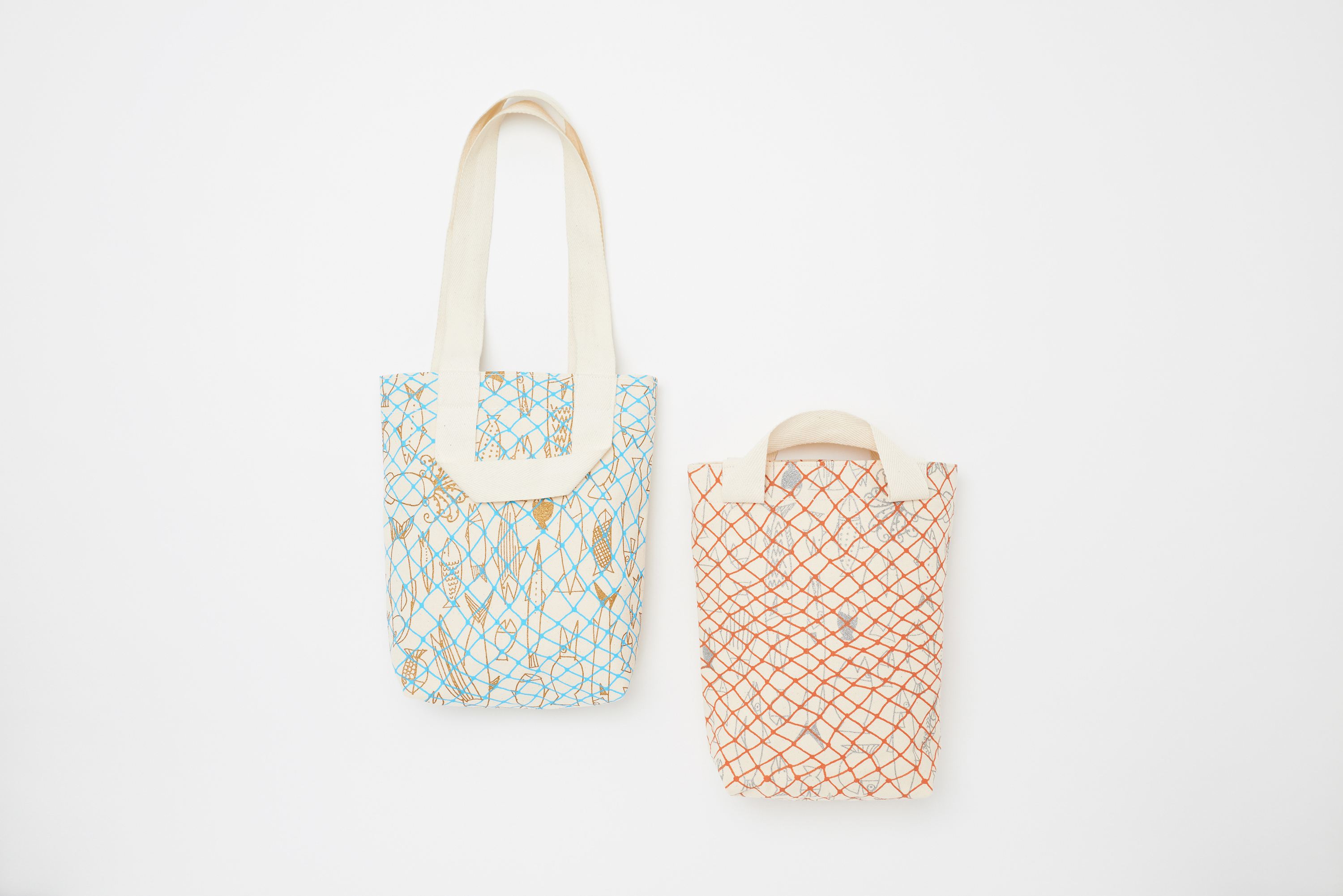
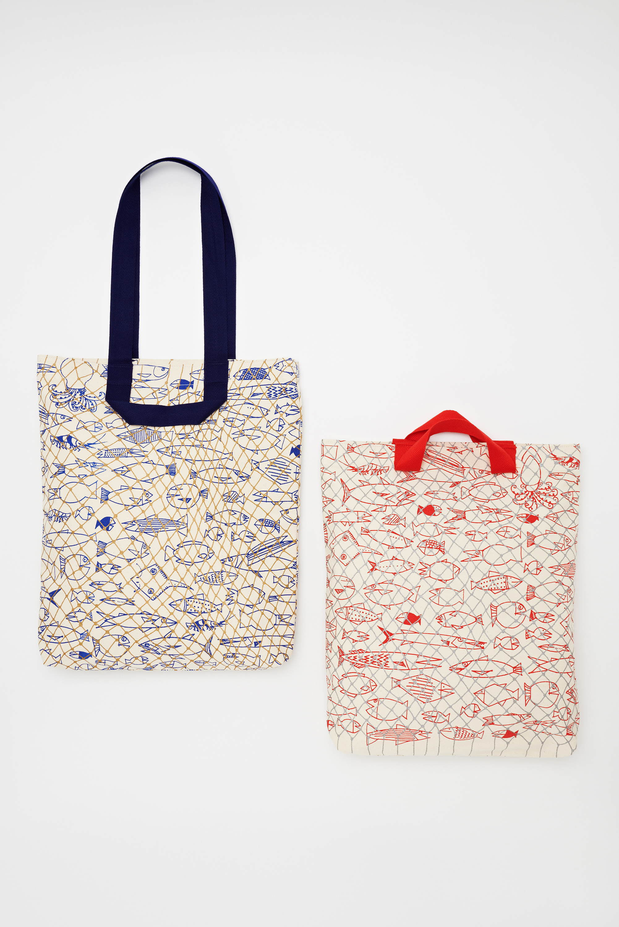
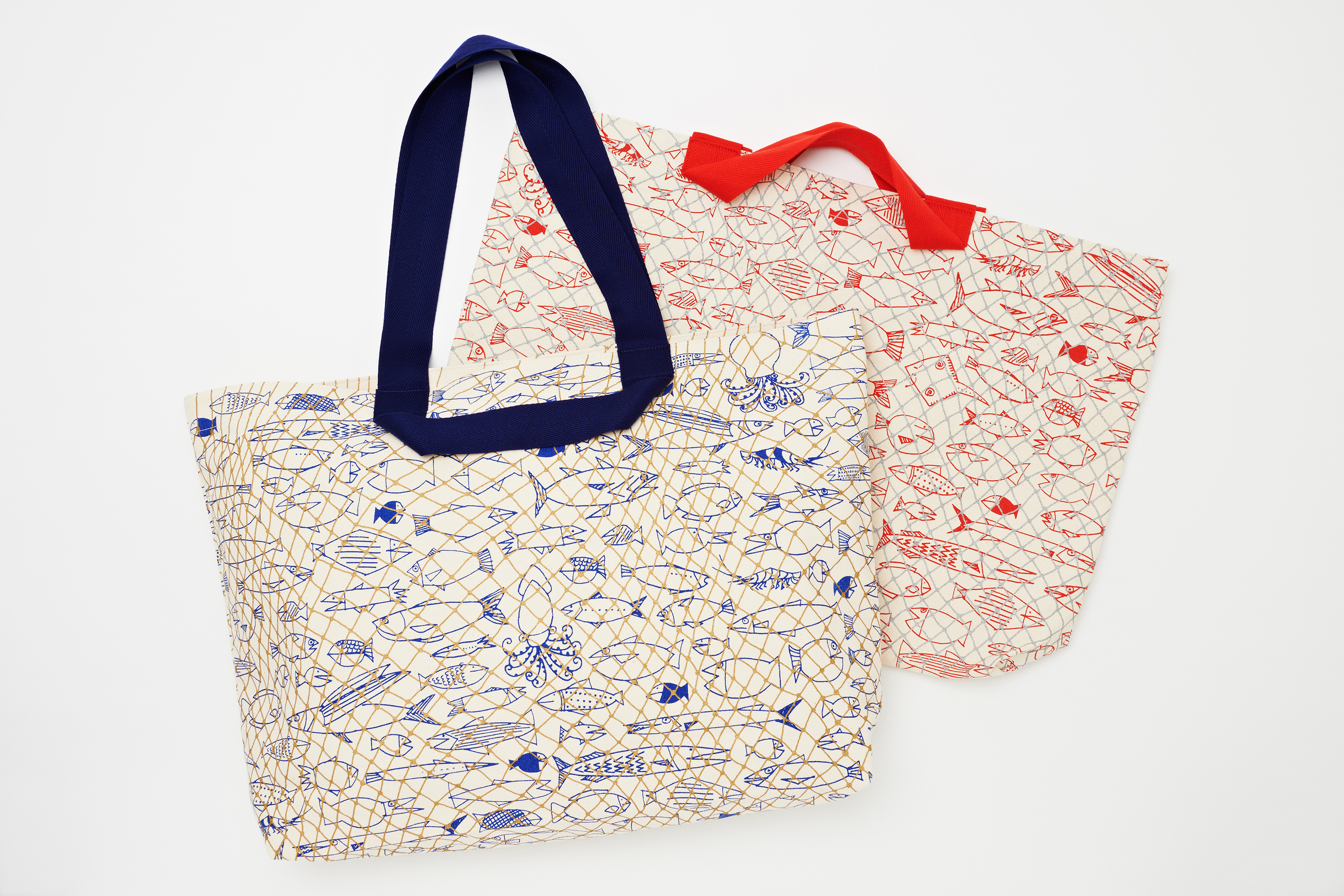
buona pesca
東日本大震災の被災地のアイデンティティとなるような材料を生み出す試み。テキスタイルは被災地での雇用創出を目的としてデザインされた。網にかかった魚のイラストは、スイス在住のデザイナーAOI HUBERによるもの。漁師の奥さんたちを中心にしたつくり手が親しみを持って仕事ができるような「大漁 / buonapesca」をコンセプトにした。buonapescaバッグは、「肩かけ」と「手さげ」2種の持ち方が1つになったデザイン。シンプルな縫製で完成するように設計されている。
This is a product line created for ISHINOMAKI LABRATORY, that was initially founded to help people in need after the great TOHOKU earthquake and ensuing tsunami in Japan, in March 2011. Ishinomaki is a seaside town and fishing is a large part of their identity. To give the people hope and strength to live on, swiss designer Aoi Huber has created illustrations showing fish from this region caught in a net, which stands for a big catch/ buona pesca, a homage to all fishermen from that region.DRILL DESIGN organized and directed this project and designed the ‘Buona pesca’ bag which is a design solution to combine a shoulder with a tote bag by simple sewing as fisherman’s wife’s side job.
–
illustration : AOI HUBER
Brand:ISHINOMAKI KOBO
Design Period:2011-
Photo : Ryoukan Abe
手で簡単に折り曲げられるフロストガラスのような紙を使った折り紙トレイ。水をはじく素材なので、洗って繰り返し使うことができる。
–
Brand : Kaminokousakujo
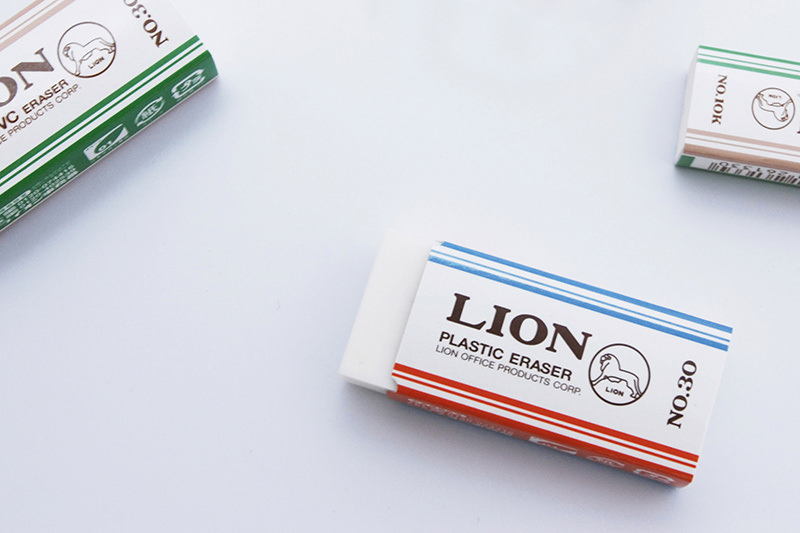
LION
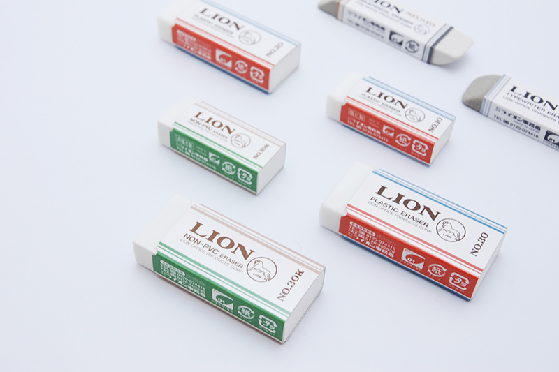
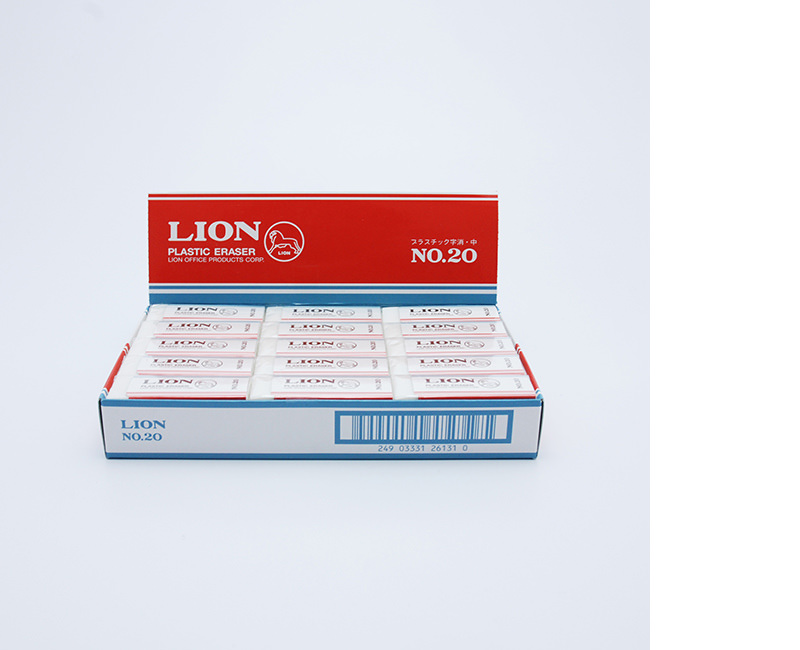
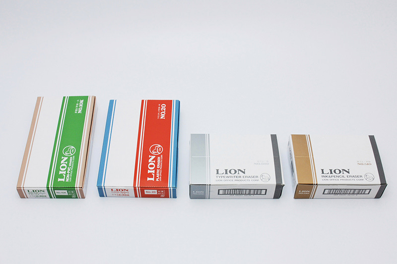
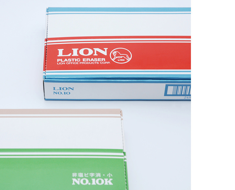
創業200年の事務用品メーカーの消しゴムパッケージ。会社の持つ伝統を伝えるために創業当時のロゴを改めて見直し、デザインの主役としてとりいれた。色の組み合わせはあえて現代的な配色を施し、クラシックなロゴの雰囲気とバランスを取っている。また、永く愛される商品となるよう、普遍的な親しみやすさもデザインのテーマとなっている。
A packaging design for an eraser by a 200-years-old office supply manufacturer. By refreshing the first logo of the company, it was possible to convey their long tradition. The chosen colors are a well-balanced combination of a traditional and modern style. This products shall be cherished for a lifetime with its universal friendly design.
–
[Package Design]
Client:LION OFFICE PRODUCTS CORP.
Design Period:2009
Award : Package Design Award 2013
sndek
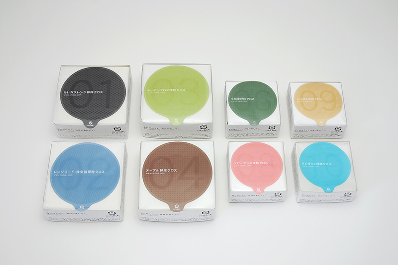
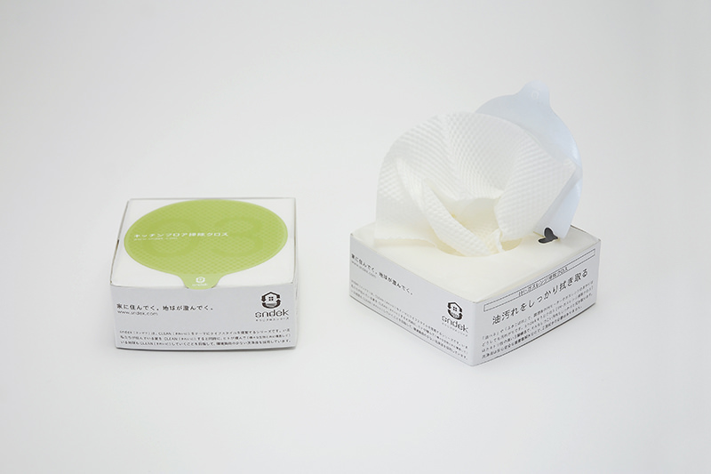
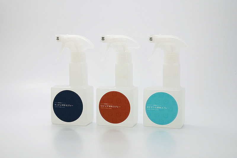
重曹を成分とした自然派の家庭用掃除シートパッケージ。通常の袋パッケージの「取り出しにくさ」、枚数が減ったときの「つぶれ感」を改善するため、袋に紙の帯を巻いて立体的にした。用途別のシリーズを数字と色でシンプルに表現し、「出しっぱなしにして、いつでも掃除できる」という生活シーンを提案している。
This is a new packaging design trying to improve the commonly used plastic bags for wet sheets. With a three dimensional structure by wrapping around a paper strip, the wrinkles created by sealing the opening can be prevented. With this little innovation the packaging will keep the wet sheets moist from evaporating.
–
Client:HATTORI PAPER
Design Period:2006
Award : Japan Package Design Award 2013